from the archives
Pixel by pixel death spiral
So, tabs, good friends. Besides all the issues of drag behavior, biased position, and so on and so forth including actually looking passable, there is one final issue that remains.
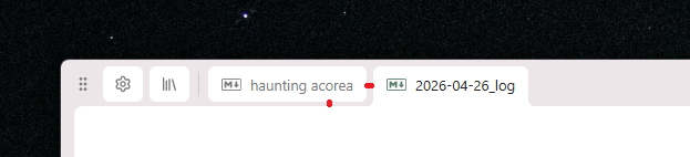
What do you notice here, dear reader? The gap that is oh-so-perfect between tabs, and the gap between tabs and the edit area, are shown to be unequal more clearly by the convex curve in the selected tab connecting it down to the edit area.
"Have you tried—" yes. I tried equal spacing, I tried all logical combinations of spacing. A tab gap of 6px and an edit-area gap of 4px looks best in the standard use case, but the curve brings attention to this difference -- a locally ugly zone.
"Have you tried—" yes. I tried all sorts of different curves, I actually settled on a uniform curve with radius 5px instead of 6px, which should not logically look better but does.
So did I end up finding a good solution to this issue? No. I'll just have to live with this sickening knowledge for the time being.

The Legendary 'New Tab'
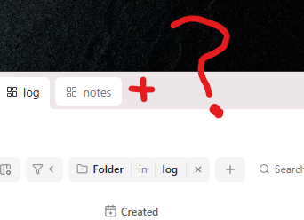
So if you have multiple things that can be in a tab, what does the new tab button do?
These come to mind:
- Make new empty document
- Make a placeholder document with multiple options in it, e.g. new document, new view, more
- Dropdown at the actual '+' button, with the options in a context menu there
Well, what do people expect? Many applications have a default sort-of-index page, e.g.:
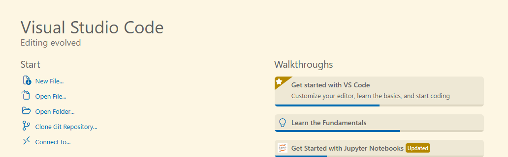
VSCODE, on launch

Obsidian, new tab
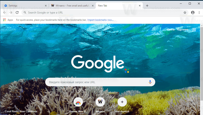
Chrome, new tab
I am a fan of the instantly focused search, a bit like when you press the windows key on windows 10/11. If we simply make this an instance of the quick action search/utility, akin to the command palette in vscode, it could combine all the utility we need above.
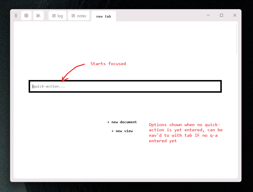
Sketch of new tab page
So, I initially tried it with the centered search, as seen in the sketch, but it felt off-balance, so I just went and stared at the google home page (google.com) and realized the large google logo offsets it nicely, and figured I would borrow this pattern, and finish this long sentence.
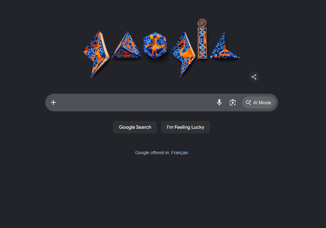
The thing that came to mind immediately was something like this, rather than a big logo (*at the time of writing, we had no logo other than the lime emoji [🍋🟩]):
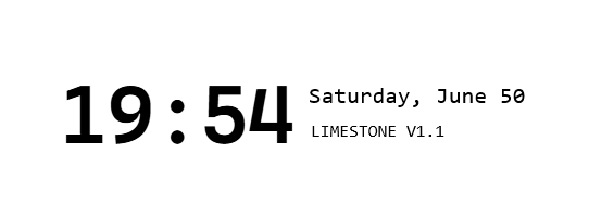
With a little fiddling and font-play, I ended up with something fine, this:
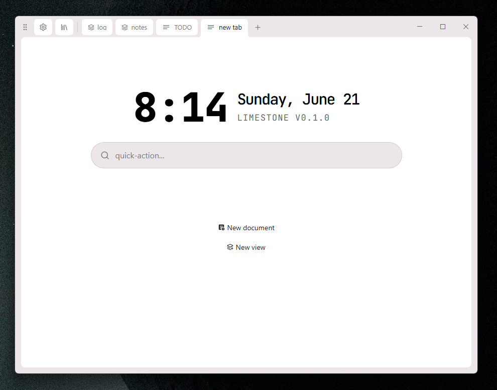
After some further review and consulting some friends, the rounded search gives the internet-search feel too strongly, which I agree with. Further, I noticed the time element does not quite align with the elements in the column to its right. I reduced the font size of the time one pixel at a time, until I got the match I wanted, as well as adding an am/pm indicator below the line there.
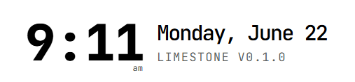
Hmm wait

Ah there we go, the am/pm was throwing me off before. Sizing is a bit fucked still but I'll obsessively adjust that later.
Tab state
I'll make this very brief, I ultimately settled on the fact that a tab object has only a very basic idea of what it contains and rather does not care that much. Any tab may be pinned, any tab may be dragged around and fucked with, etc.
Did you find this log entry incoherent? Me too
See you in the next one!